- Typologie
- Concept study
- Projekt
- nGbK Karl-Liebknecht-Straße XXX
- Jahr
- 2022
- Ort
- Bezirk Mitte, Berlin, Deutschland
- Contribution to an invited competition for the new gallery space of the nGbK in Karl-Liebknechtstraße - 2nd place.
- team c/o now
- Andrijana Ivanda, Duy An Tran, Ksenija Zdešar, Markus Rampl, Paul Reinhardt, Tobias Hönig
 XXX
XXX
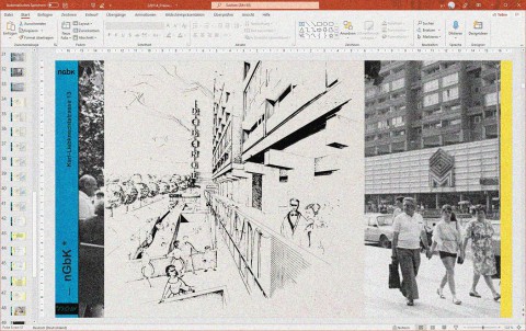
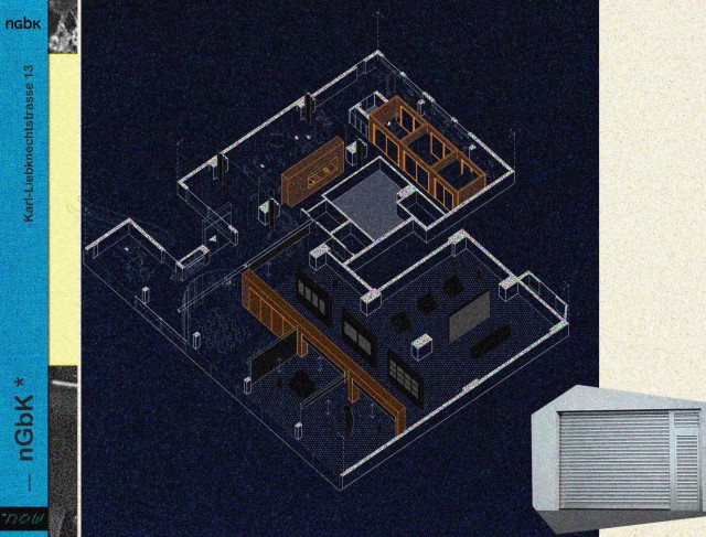
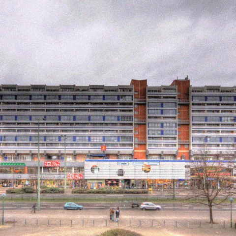
Abb.___Presentation slide: Original concept sketch of the building combine and contemporary photography.
unknown
![]() XXX
XXX
Abb.___© c/o now
 XXX
XXX
Abb.___© c/o now
![]() XXX
XXX
Abb.___© c/o now
 XXX
XXX
Abb.___© c/o now
 XXX
XXX
Abb.___In the competition, so close to the urbanistic and architectural total failure of the new old "Stadtschloss" (The City Palace), the temptation was great to try it with a "Kritische Rekonstruktion" (critical reconstruction) of the original facade of the market hall at Alexanderplatz from GDR times, as shown here in one of the first sketches. It should turn out that the facade is not part of the competition.
© c/o now
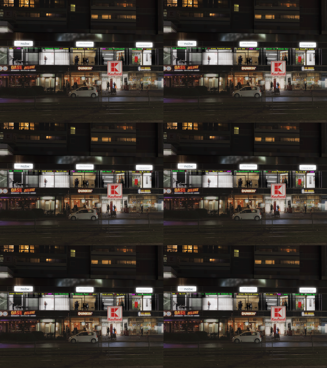
The competition documents mention the former use of the future rooms of the nGbK as a fast-food restaurant. In fact, since the completion of Liebknechtstraße 13 in 1973, a restaurant was located here on the 1st floor, which belonged to the then "Berliner Markthalle am Alex", the replacement new building for the historic Zentralmarkthalle. The future rooms of the nGbK probably housed a do-it-yourself store belonging to the market hall. Much could be said about the planning and construction of the building, for example about the originally attached, striking facade of white concrete molded bricks.
Unfortunately, we don't have time for that today. However, we would like to integrate two aspects that the architects' collective, from which the original design of Liebknechtstraße 13 originated, gave to the building complex into our proposal for the new rooms of the nGbK:
First of the Liebknechtstrasse 13 residential building stands on a three-story base, which is accentuated in terms of urban development by the terraced corner building facing Spandauer Strasse and by the former market hall, whose former restaurant now houses the nGbK. The terraced exterior access to the first two upper floors brings the street space into the vertical. Units on these levels are thus not only given a specific address, but here in itself a reduction of threshold spaces is already envisaged, leading an at least semi-public space directly in front of the units.
The future rooms of the nGbK are located here, as already mentioned, in an accentuated, particularly prominent position. The nGbK spaces immediately adjacent to this "vertical street space," what the RFP calls the "entrance foyer." By redesigning the main entrance, we not only clearly articulate this forgotten spatial configuration again, we also think of this space as a hybrid overlay - not only of the nGbK's internal intersections, but also of the building's residents and the street space.
A second point, which, as it were, determines the stock parameters per se, can be traced back to some extent to the fact that Liebknechtstrasse 13, including the new Markhalle, was a pilot project of the then still young GDR Baukybernetik. The building is characterized by its structure, which is oriented towards an economized system construction. This also applies to the future rooms of the nGbK. With a view to the connection points of stabilized and changing spatial configurations, our proposal is therefore largely oriented to the conditions of this structure, if only for economic reasons.
Of course, we are talking here primarily about the connections of space-forming elements to the ceiling, which we think of as being exclusively congruent with the grid of the beams. Just as the constellations of the people who were, are, and will be the nGbK are different, so are the spatial correspondences of these constellations - there is probably no need to elaborate on this at this point. One of our fundamental motives for this proposal was therefore to offer the nGbK - even after it had moved in - space that could be appropriated again and again in different ways.
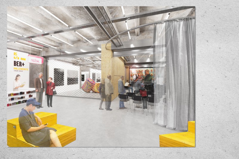
We have therefore chosen to configure the entire spatial structure with 3 space-creating elements. One element organizes the office spaces of the nGbK. The middle element incorporates, among other things, kitchen elements and plays a mediating role between offices, workgroup area and the distributive threshold space of the foyer. The third element ensures the basic division of the publicly accessible part of the nGbK - namely the foyer, the exhibition space and the area for events, stay, etc.
The basic zoning done with the space-creating elements can be continuously reconfigured via folding walls, rolling doors and curtains.
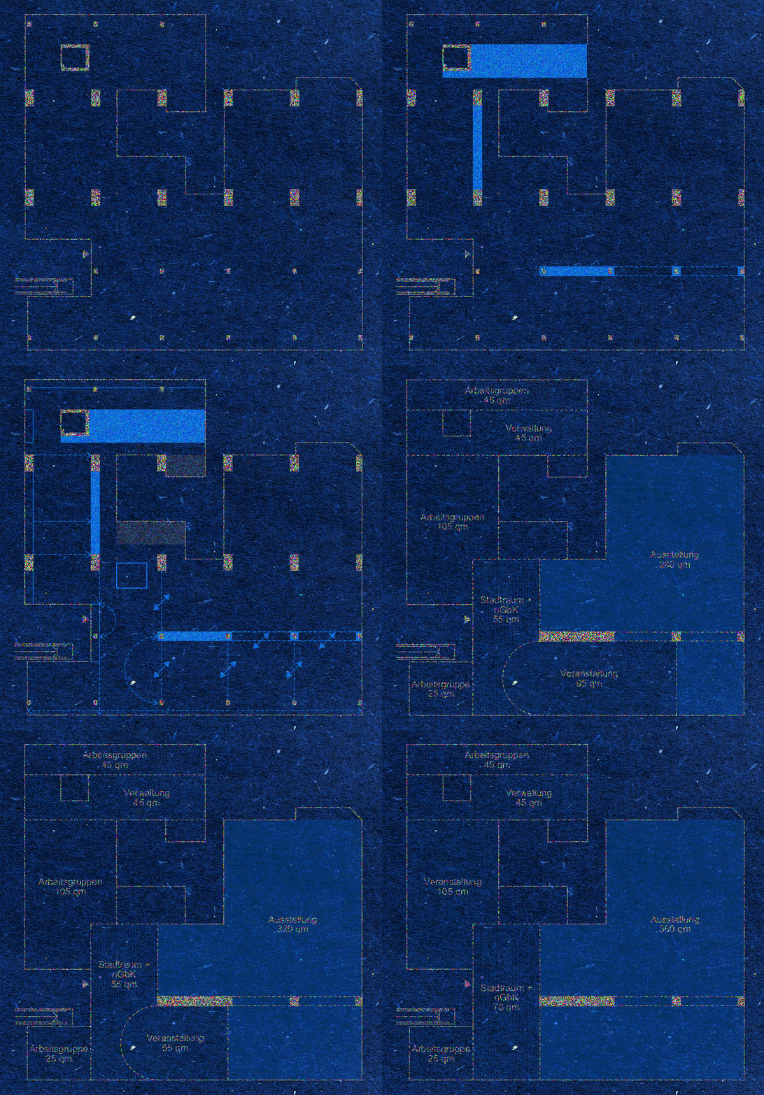
In the axonometry, you can see once again in blue the so-called "space-forming elements" and gently indicated the "space dividers".
The schematic drawing shows the maximum divisibility of individual room cells - the basic exhibition area of 240 square meters is of course freely playable anyway, depending on the exhibition concept.
There are 5 different variations for the area accessible to the public: Variant 1 is the strictest division with 240 QM exhibition, 120 QM event space and with 70 QM foyer, or threshold space, i.e. the space where the overlapping of the overall structure is to take place. This overlapping can of course be forced by using this variant, where the event space overlaps into the threshold space. At the same time, we see at the bottom right how the exhibition space takes up a field on the facade. As said, depending on the exhibition concept, there is even the potential here to expand even further. In the maximum version of the exhibition area, of course, one completely exhausts the overlapping of the event area and the threshold space, and the event area gives way in the overall spatial structure to the area intended for working groups in all other configurations. We know that within a multi-voiced institution such as the nGbK, this will require some negotiation work, but we can well imagine that it may well be possible to exhaust such a maximum variant and thus move closer together for a time!
At this point, perhaps a brief digression on the keyword sustainability: The basic spatial concept with its few room-zoning fixtures can respond to changes in operation - adaptations to changes in room use are possible at any time without great technical and economic effort - the architectural concept allows the integration of furniture from the current stock of the nGbK - proven, simple, cost-effective construction systems, constructions with little "gray energy" are used (e.g. simple wooden stud walls) - low-maintenance, durable and hard-wearing materials that make economic and ecological sense for their purpose - interior paints, coatings, fillers should be free of formaldehydes and other solvents; natural products should be used - all structural constructions can be easily replaced and maintained at a later date without great technical and economic effort - by reducing the number of fixtures that reach the existing ceiling and zone the room, the future building services (heating and ventilation systems) below the existing ceiling can be freely and easily adapted to the specific requirements of each use (fixed office workplaces, exhibition rooms, changing uses, etc.) in consultation with the landlord (WBM). ). The possibility of multiple use of energy, e.g. by implementing heat recovery, etc. in the building services system provided by WBM is to be further coordinated.
